Sunday, November 29, 2015

Field Exercise 8: Data Collection with ArcCollector

Introduction:

The purpose of this exercise was to gain experience creating domains and feature classes to use in ArcCollector. The feature class was used in the ArcCollector app to collect data about on-campus and off-campus features using a smartphone. Information about cars parked on campus was collected to determine similarities and differences between cars owned by faculty and students. Information about cars parked at a local grocery store, Festival Foods, was used to add to knowledge of cars driven in Eau Claire. Knowledge of online data collection is very useful in today's modern age, and knowing how to build feature classes for easy data entry is important for conducting efficient surveys.

On-Campus Collection:

Background:

Cars on the UW-Eau Claire campus were surveyed to determine any patterns between student and faculty cars. The campus has 18 parking lots, and 8 were surveyed (Figure 1). Lot types include Faculty Staff (F), Student (S), Guarenteed Facutly/Staff (G), Residence Hall/Student (R), Bollinger Lot (B), Recreation Lot (E), and Public Meter. The Bollinger Lot and  Recreation Lot were not surveyed because they were off campus.

Figure 1: The parking map shows all parking lots on the UW-Eau Claire campus. Eight parking lots out of eighteen were surveyed to determine what similarities and differences existed by cars driven by students and faculty. The map was obtained from the UW-Eau Claire Parkig Office http://www.uwec.edu/about/maps-directions/upload/campus-parking-map.pdf
In order to determine similarities and differneces between student and faculty cars, lot types were combined. Student cars included cars parked in Student and Residence Hall/Student lots.Faculty cars included cars parked in Faculty Staff and Guaranteed Faculty/Staff lots. Public Meter was its own entity and was surveyed to see if any patterns existed in those lots.

Methods:

The survey began with the creation of domains in ArcCatalog. Domains are defined values that are acceptable for attribute values. There are two types of domains: range and coded. Range domains set allowable number values for an attribute while coded domains set codes for any type of data, which include text, number, and date (ESRI, 2015). Both range and coded domains were used for the exercise. Instructions on how to properly format domains were found on ESRI's help website (ESRI, 2015c). The domains used in the on-campus collection included the following:
  • Make
  • Color
  • Size
  • Type 
  • Condition
  • Lot Type
  • Date
  • Temperature
The date and temperature domains were range domains while the other domains were coded. Setting domains increased efficiency and prevented errorrs in data collection. 

The next part of the exercise was to use ArcCatalog's feature class builder to create feature classes using the recently created domains. A point feature class was made for the car survey, which would be used to collect points in the ArcCollector app (Figure 2). The coordinate system was set to WGS 1984 Web Mercator (auxillary sphere) and the data was themed. Since the feature class domains were already made, creating the feature class was easy. Instructions about how to format the feaure class was obtained from ESRI's help website (ESRI, 2015c).

Figure 2: The picture shows the ArcCollector interface, as used on a smart phone. Attributes can be designated using the app , and domains control the allowable values of the attributes.

Once the feature class was created, the feature class was published to my ArcGIS server for use in ArcCollector online. Before publishing, I had to make sure I was signed into UW-Eau Claire's enterprise account. Information about how to publish to ArcGIS online was found on ESRI's help website (ESRI, 2015c).

After the data was successfully published, data was collected in the field. This required going to each car and recording attribute information. Data collection took two hours, and positional accuracy ranged from 3-5m on campus (Figure 3). Instructions on how to collect data using ArcCollector was obtained from ESRI help website (ESRI, 2015b).

The final part of the exercise was downloading the collected data from ArcGIS online and analyzing it in ArcMap 10.3.1.

Metadata:


Figure 3: Metadata for the on-campus vehicle survey.


Figure 4: Metadata for the off-campus vehicle survey at Festival Foods in Eau Claire, WI.

Discussion:

The data shows that most similarities and differences between cars driven by students and faculty resided in parking lot location, car type, and car make. Figure 5 shows that most student parking is on upper campus while most faculty parking is on lower campus. This is because students live in the residence halls and faculty teach in academic buildings.

Figure 5: The map shows the location of all cars surveyed during the field exercise. Lot types were combined to form the categories of student cars, faculty cars, and metered parking cars. Student parking is mostly on upper campus, while faculty parking is mostly on lower campus.

Results show the most popular type of car driven by both students and faculty was a sedan (Figures 6 and 7). In fact, 17 out of 39 students drove sedans, while 16 out of 48 faculty drove sedans. The next most popular types of cars were SUV's, with students driving 8 and faculty driving 13. A close third for students were hatchbacks (7). It is likely sedan was the most popular type of car because sedans are stylish and less expensive than trucks or sports cars.

Figure 6: The map shows the most popular types of car driven by students were sedans, SUV's, and hatchbacks.

Figure 7: The map shows the most popular type of cars driven by faculty were sedans and SUV's.

To continue, the make of car for students and faculty showed similarities. The most commonly driven cars among students (39 total) were Toyota (7),  Ford (7),  Chevy (7), and Subaru (5) (Figure 6). Faculty showed similar results (48 total) with Toyota (12), Honda (7), Ford (5), and Chevy (5) (Figure 9). Toyota, Ford, and Chevy are cars brands sold widely in the U.S., and are not too expensive. This can help explain why faculty and students drive these brands of cars.
Figure 8: The most common makes among student cars were Toyota, Ford, Subaru, and Chevy.

Figure 9: The most popular makes of faculty cars were Toyota, with 12 out of 48 cars. 

Since data was only collected for 16 cars parked in public meter spaces, the results should be taken with a grain of salt. The most significant trend I found was the most popular make of car in metered spots was Ford ,with 6 out of 16 (Figure 10) . Many other makes were present, but in much smaller quantities.

Figure 10: The most popular make of vehicle in public meter parking was Ford, with 6 out of 16 vehicles.

Considerations and Future Improvements:

After completing this lab, I realized I could have done a few things differently to improve the lab. For one, I really could have used a notes field for data collection. For example, I did not make the brands Buick or Fiat as domains in my feature class. I could have used notes to record these brands of cars, but I forgot to add a notes field before I went out and did my survey. A second thing I could improve upon would be to take pictures with ArcCollector app, which would tag a photo to a location. I could have used this to record unlisted car brands and provide better details in my lab report.

The results of the survey should be taken with a grain of sand since only 89 out of hundreds of parked cars on campus were surveyed. I did not have time to survey every car, so I did my best to survey randomly by walking diagonally between surveyed cars. In order to obtain more accurate results. I would have to survey more cars if not all of them.

Off-Campus Vehicle Survey:

Seventy-six (76) vehicles were surveyed at the Festival Foods grocery store in Eau Claire a week after the campus vehicle survey (Figure 11). The purpose of the off-campus survey was to use the experience from the on-campus survey to improve feature class design, data collection, and results. In addition, the survey would help determine trends among Eau Claire drivers.

Figure 11: The yellow box indicates where the Festival Foods parking lot is located. 

In order to improve both feature class design and data collection, more makes of vehicles were added in the make domain. The following makes were added: Buick, Cadillac, GM, GMC, Infiniti, Kia, and Land Rover. A notes field was added to the feature class prior to collection so notes could be recorded in the field if need be. Finally, the Parking Lot Type domain was deleted since there was only one parking lot for Festival Foods.

Methods from the on-campus vehicle survey were used in the off-campus survey to create domains, a feature class, and an ArcGIS online map. Collection and exporting of data also followed the same procedure. The added notes field was handy in recording the makes of vehicles that were still not in the feature class, such as Misubishi and Volkswagen.

Results show many vehicles (76 total) at Festival Foods were Ford (12), Toyota (11), and Chevy (9) (Figure 12). In addition, collected data demonstrates the most popular types of vehicles at Festival Foods were Sedans (35) and SUVs (19) (Figure 13). I believe Ford, Toyota, and Chevy were the most popular makes because these cars are relatively inexpensive, durable, and handle well in the snowy conditions of Eau Claire. Sedans and SUV's were the most popular types of cars because sedans are convenient for family travel and SUV's are well equipped for handling snowy conditions.

Figure 12: The off-campus surveyed revealed the most popular makes of vehicle were Ford, Toyota, and Chevy.


Figure 13: The survey revealed most people drove sedans and SUV's.

Conclusions:

The field exercise helped me learn how to survey data in the field using the ArcCollector app on my smartphone. Before conducting the survey, I had to carefully create domains that would make data collection easy and efficient. This made me think about what data I wanted to survey and how I wanted to survey the data before I ventured into the field. This taught me preparation is critical to the success of data collection. From the on-campus survey, I learned students and faculty often drive sedans and SUV's that are Toyota, Ford, or Chevy. The results should be taken with a grain of salt since only 89 out of hundreds of cars parked on campus were surveyed. From the off-campus survey, I learned many people drive Ford, Toyota, and Chevy vehicles that are commonly either sedans or SUV's. Overall, knowledge of feature class design, data collection, and ArcCollector will benefit me greatly in a geospatial career.

Works Cited:

ESRI. (2015a). "An overview of attribute domains." Retrieved from: http://webhelp.esri.com/arcgisdesktop/9.2/index.cfm?TopicName=An%20overview%20of%20attribute%20domains

ESRI. (2015b). "Collect data". Retrieved from: http://doc.arcgis.com/en/collector/android/collect-data/collect-tutorial.htm

ESRI. (2015c). "Prepare your data in ArcGIS for Desktop". Retrieved from: https://doc.arcgis.com/en/collector/android/create-maps/prepare-data-desktop.htm

Saturday, November 14, 2015

Field Exercise 7: Topographic Survey

Introduction:

The purpose of this exercise was to conduct a topographic survey of the UW-Eau Claire campus mall using a dual-frequency GPS and Total Station. Data collected was used to create 2D and 3D surfaces of the mall. Experience gained in using high-grade survey equipment, as well as trouble shooting skills developed in the exercise, will benefit any career in the geospatial workforce.

Study Area:

The UW-Eau Claire campus mall was the main survey area for this exercise (Figure 1). The area is surrounded by buildings, including the Davies Student Center, Phillips Science Hall, Schnieder Business Hall, Centennial Hall, Schofield Hall, and the McIntyre Library. The mall area has many sitting stones, small trees, walking paths, and even a small creek. An important note is the mall has little elevational change (Figure 1).

Figure 1: The study area is the UW-Eau Claire campus mall, which is surrounded by academic buildings.

Figure 2: The campus mall has relatively little change in elevation throughout the landscape.
Methods:

High-grade survey equipment was used to collect distance, GPS, and elevation data for the study area. Equipment used in the exercise included the following:

Equipment list:
  • Topcon Hiper
  • Topcon TESLA
  • Topcon Total Station
  • Prism rod (used with the Total Station)
  • MiFi wireless router
  • Flags and pink tape for marking 
Surveying Using the Hiper

For the first part of the lab, we used the Topcon Hiper and Topcon TESLA units to collect elevation and GPS data of the study area (Figure 3). Before surveying could occur, the equipment had to be set up. The Topcon Hiper was screwed to the top, the TESLA unit was attached to the surveying rod, and the Mifi unit was attached to velcro on the surveying pole. A particular sequence was used to power up the equipment: Hiper first, Mifi second, and TESLA third.

After the equipment was set up and powered on, a folder was created on the TESLA to collect the elevation  and GPS data. The folder contained a file name and properties for collecting the data. The TESLA was set to collect elevation and GPS data in two different modes: solution and quick. Solution mode was set to take 10 points for each data type (elevation, and GPS), then average all 10 points to create one averaged point. Quick mode was set to average 5 points into one. The TESLA was set up to collect GPS locations in NAD83(2011), UTM Zone 15.

The last step to complete before starting the survey was to connect the TESLA to the Hiper using Mifi wireless router. The TESLA was connected to the TESLA once the rectangle at the top left was green and the Hiper icon appeared in the top right of the TESLA screen.

Now that the equipment was set up, powered on, and had a folder created for the data, we conducted the survey of the study area. We surveyed 100 points with the units. Before collecting each data point, the surveyor had to make sure the surveying rod was level with the ground. A bubble level built into the surveying rod helped level the rod. Our group had to make four separate folders to survey 100 points because the TESLA unit could only store up to 25 points in one folder. The TESLA unit automatically saved each point to the specified folder every time a point was collected.

The survey took approximately one hour, including setup, surveying, and take-down. Once the survey was finished, the TESLA was disconnected from the Hiper. All equipment was then powered down and put away in Phillips Hall.

Figure 3: The equipment used for the Hiper survey included the Hiper (top of rod), TESLA (middle unit), and surveying rod. The unit was relatively easy and efficient to use.

Surveying using the Total Station:

For the second part of the lab, we used the Topcon Total Station to collect elevation, distance, and GPS data of the study area (Figure 4). This is similar to the distance azimuth survey completed in Field Exercise 3. We used the Topcon Hiper and Topcon TESLA units with the Total Station to complete the survey.

The first step of collection was to set up all the equipment. The same procedure as discussed above was used to set up the Topcon Hiper and Tesla. Setup of the Topcon Total Station will be discussed later. After the initial setup of the equipment was complete, the Hiper, Mifi, and Tesla were turned on. The Mifi was then used to connect the Tesla to the Hiper.

Before setting up the total station, it was critical to collect GPS data for the occupied point and multiple backpoints. The occupied point is where the Total Station is grounded upon. Backpoints are points taken in the study area for the Total Station to reference when determining the location of other points. Our group collected three backpoints so that our data would be accurate, and we would have a variety of backpoints to choose from. It was important to collect very accurate backpoints and an occupied point because the accuracy of these points would determine the accuracy of our resulting data.

After collecting our occupied point and backpoints, we connected the Tesla and Total Station using the bluetooth on both devices. The bluetooth was first turned on for the Total Station, and then the Tesla was connected to the Total Station. This process had to be followed in this order because it would not work otherwise.

Setting up the Total Station was the most time-consuming process in the field that had many steps, as discussed below:

Tripod Setup (Figure 4):
  • Extend legs equally to a height that will position the instrument at a comfortable height for viewing the instrument
  • Attach the instrument to the tripod; ensure the instrument is centered over the occupied point
  • Spread the tripod's legs equally to ensure a solid base. 
  • Lock the locking mechanisms on the tripod 
  • Step on footpads to ground the tripod over the occupied point
Instrument Setup (Figure 4):
  • Take lens cover off the instrument and wipe lens with a gentle cloth
  • Twist the knobs on the instrument to neutral. This will help in leveling the instrument
  • Level the instrument on the first plane (over one of the tripod legs) using the two levels on the instrument
    • Use knobs to level the instrument. If the knobs can't adjust the instrument enough, adjust the legs and start over. 
  • Repeat the leveling procedure over the two other legs (planes)
  • Use the "laser plummet" feature on the instrument to ensure the instrument is centered over the occupied point. 
    • Adjust the instrument if the plummet is not directly on the occupied point
  • Measure the height from the occupied point (ground) to instrument (measure to the yellow line on the side of the instrument)
Surveying Procedure (Figures 5 and 6):  
  • Create a new job in Field Magnet to collect your data
  • Go to Survey
  • Enter the following:
    • Instrument height (m)
    • Prism rod height (set the rod to 2m)
    • Set the occupied point and backsight point (using the points collected earlier in the exercise)
  • Collect points
    • Set the quick and solution settings (determines how many measurements the instrument will average to determine one point)
    • Set your naming/numbering sequence for your points you are collecting
    • Have one person take the prism rod to the site you want to collect a point 
      • the person must hold absolutely still while taking the point 
    • Sight the Total Station onto the prism rod
      • Use the large knobs on the side of the instrument to unlock the head. This will allow you to turn the head up/down and left/right, which will make macro adjustments easier. Turn the knobs again to lock the instrument when relatively close to the prism rod.
      • Use the smaller knobs on the side of the instrument to make micro adjustments to sight in the Total Station to the prism rod
    • Once sighted in, hit the collect button on the TESLA, which will tell the Total Station to take the point
    • Collect 25 points
      • Either end the survey after 25 points, or create a new job to keep collecting
  • Take down
    • Disconnect the Hiper from the Total Station
      • General tab, disconnect
    • Disassemble all equipment and put away.
Figure 4: The Topcon Total Station was used to collect distance, elevation, and GPS data. The unit took a long time to set up, and collecting data also took a considerable amount of time.

Figure 5: A lab partner holds the prism rod, which was used to collect distance, elevation, and GPS data. The rod is placed in the location where you want to collect data, and the Total Station is sited in on the prism to collect the data.

Figure 6: A teammate sights the Total Station onto the prism rod in the distance, which is held by another teammate. The third teammate operates the TESLA (located on the right side of the picture) to collect the acutal point, 

Metadata:


Figure 7: Metadata for the Hiper GPS survey.

Figure 8: Metadata for the Total Station GPS survey.

Data extraction:

The data had to be extracted from the TESLA unit and stored on a removable flash drive after the surveys were completed. The following steps were used to extract the data:
  • Go to Magnet Field
  • Go to Exchange
  • Select your file(s) for export
  • Select the export format as .txt
  • Select your flash drive as the device you want to export the data to
  • Name the output folder
  • Set the delimiter and plane coordinate position settings
  • Finish
2D Rendering:

The exported text file was edited on a computer to delete any unnecessary text. The exported data was then used in ArcMap to create a feature class that contained x,y,z data. The Kriging interpolation method was used to create a raster surface of the elevation data for both the Hiper and Total Station survey (Figure 9).

3D Rendering:

Data for both the Hiper and Total Station was used to create 3D surfaces of the UW-Eau Claire campus mall (Figures 10 and 11). ArcScene was used to build the 3D models. In ArcScene, the interpolated surfaces (kriging) from both surveys were brought into the scene, and the baseheights were rendered on a floating surface. Since the campus mall had little elevation change, the rendering was set to a factor of 3.

Discussion: 

The data collected for the campus mall was relatively accurate. Figure 9 shows the Hiper survey produced more detailed results than the Total Station survey. This is because 100 points were collected using the Hiper, while only 25 points were collected using the Total Station. Our group only collected 25 points using the Total Station because by the time we had all the equipment running and had solved many issues, it was time for our group to go. In addition, the Hiper could only survey 25 points for each project. If we wanted more points for the Total Station survey, we would have had to retake our occupation point and backsight point.

The 3D surfaces in Figures 10 and 11 show changes in elevation of the campus mall relatively well, but the base rendering had to be set to a factor of 3 to show the surface. It was hard to see any 3D elevation changes without exaggerating the rendering. This is because the campus mall has very little elevation change. An inaccuracy can be seen in Figure 11 at the top right-hand portion of the image. This is because only 1 point was collected in this area. To fix the error, we should take more points in that area. The 3D model in Figure 8 is very accurate since we took 100 points in many different places.

Figure 9: The two maps show elevation data for the UW-Eau Claire campus mall determined using two different methods. The top map demonstrates the accuracy of the Hiper survey, and the bottom map documents the accuracy of the Total Station survey.
Figure 10:The 3D surface for the Hiper survey was created in ArcScene by rendering base heights on a floating surface by a factor of 3. Since 100 points were used to construct the model, the model is very accurate.

Figure 11: The 3D surface for the Total Station survey was created in ArcScene by rendering base heights on a floating surface by a factor of 3. Since only 25 points were collected for the model, the model was not very accurate in some places. For example, only one point was used to represent the elevation of the top right portion of the model. This resulted in a jagged elevation suface in the model, as seen above.

Conclusions: 

The exercise taught me how to conduct geospatial surveys using a dual-frequency GPS and a Total Station. By conducting a survey with each method, I learned the dual-frequency GPS takes much less time to use and still produces quality data. Although the Total Station produces quality data, it takes a very long time to set up and there are many opportunities for errors to arise in the technology when conducting the survey. Overall, the exercise added to my knowledge of geospatial tools and increased my problem-solving skills, which will be valuable in the geospatial workforce.

Friday, October 30, 2015

Field Exercise 6: Navigation with Map and Compass at the Priory

Introduction:

The purpose of the exercise was to navigate to different waypoints at the Priory using the maps we constructed in Field Exercise 5. The exercise developed our skills using a compass and navigation techniques. The skills learned in this exercise will be beneficial for any career in the geospatial workforce, especially an outdoor-related career.

Study Area:

The navigation exercise was carried out at the Priory, which is a large nature reserve that has a student housing building in the middle of the property. The terrain is very hilly, and covered with trees, bushes, and prickly plants. The reserve is 8 minutes away from UW-Eau Claire, and is located on Priory Road (Figure 1). A large-scale map of the area can be seen in Figure 2.

Figure 1: The Priory is located 8 minutes away from UW-Eau Claire.

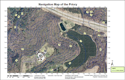
Figure 2: The large-sclae map shows the hilly and vegetated terrain of the Priory. This UTM map, created by our group, was the map primarly used in navigating the Priory.


Methods:

The UTM map of the Priory, which our group created in Field Exercise 5, was the map our group used to navigate around the Priory. Upon arrival at the Priory, Dr. Hupy gave each group 5 pairs of geographic coordinates to locate. We plotted the points using the labeled graticules on our maps.

After the points were drawn on the map, a compass was used to determine the bearing, or azimuth, from the starting point in the parking lot to the first waypoint (Figure 3). To determine azimuth, we first needed to create a straight line between the starting point and the first coordinate points. A piece of paper was used to make the straight line. Next, we orientated the "direction of travel arrow" on the compass to the first coordinate points. After that, we turned the bezel of the compass until the north sign on the bezel faced north on the map (Figure 4). We used the graticule lines to accurately determine north. Finally, we read the bearing number above the bezel to determine our bearing/azimuth (Cherim, 2013). We calculated the azimuth between each set of successive coordinate points before going on foot to find them.

Figure 3: Geographic coordinates were plotted on our maps and azimuths between successive points were determined using a compass.


Figure 4: The above diagram shows the anatomoy of the type of compass we used. Critical components of the compass include the magnetic needle, bezzle, direcion of travel arrow, orientiering arrow, and scales. Image retrieved from: https://nhtramper.wordpress.com/2013/03/31/wilderness-compass-navigation-primer/

While navigating, it is not only important to know the direction in which you are walking, but the distance you need to walk. We had determined the distance between each pair of points on the map using the ruler on the bottom of the compass. The map scale was then used to convert map distance to real-world distance (Cherim, 2013). Instead of trying to visualize how far a certain distance was in meters, we used our step counts to figure out approximately how many steps we had to take to reach our destination. For review, a step count is the number of steps a person takes within a certain distance (Conway, 2015). My step count was 60 steps for every 100 meters. Knowing the direction and distance to each waypoint was critical to finding the waypoint before starting our trek.

After determining the azimuth  and distance for all waypoints, we headed out on foot to find the waypoints using our maps and compasses. In order to find the waypoints, we used a technique called "red in the shed". This is a process in which you set the your compass to the waypoint's bearing and orientate yourself until the magnetic needle resides in the orientating arrow (Figure 4). After "red is in the shed" you walk in a straight line towards your destination, always making sure to keep "red in the shed" (Cherim, 2013).

During the exercise, we assigned roles to each group member to help keep us on track to our next waypoint. We assigned each person a role of pace counter, azimuth control, or leap frogger. The pace counter was in charge of walking ahead while counting paces to the next waypoint. They had to adjust paces to the terrain, such as adding steps when we walked up hill. The azimuth control was the person with the compass, who made sure to keep our group's bearing as close as possible to the bearing of the waypoint. The azimuth control had to make adjustments to bearing based on the terrain. The leap frogger would walk ahead of our group to a given landmark so the pace counter and azimuth control could keep track of their paces and azimuth. Our group didn’t use the leap frogger very much because we wandered as a group keeping track of our steps and azimuth together. This was not very successful, and next time I believe it would be beneficial to have a leap frogger who walked ahead to help the pace counter and azimuth control keep track of their paces and azimuth.

A global positioning system (GPS) was used to determine our location from time to time if we felt we had strayed off the path to our next waypoint (Figure 5). Once the waypoint was found, the GPS was used to ensure we had found the correct waypoint. We then took a picture of the tree on which the waypoint was based.

Figure 5: A Garmin etrex, as pictured above, was used in the exercise to track out location during the navigation activity. We also used the etrex to determine our location when we were lost.

Metadata for the collected GPS information is shown below (Figure 6).

Figure 6: The metadata documents information about how, when, and where our group navigated during the field exercise at the Priory.

Discussion:

In this exercise, we learned what parts of our map were useful and not useful. Useful parts of the maps included the aerial imagery, 50 meter graticule lines, scale bar, relative fraction, and 5-meter contour lines. The 50 meter graticules were very helpful in determing the azimuth between points, and also came in handly when we used a GPS to check our location. The aerial imagery was very useful in helping us determine where we where in relation to our waypoint. The scale and relative fraction came in handy many times because it helped us determine approximate distance to our waypoints. The 5-meter contours were decently helpful in determing how far uphill/downhill we had to trek to our destination. We also used the 5-meter contours to determine where hill peaks and valleys were. A map feature that did not come in handy very much was the red-yellow-green digital elevation model on the WGS84 map. It only indicated a few hill peaks, so our groups primarily relied on the UTM map. In the next exercise, I would not add the digital elevation model to the map. I would keep all the other map elements though.

One very important lesson the exercise helped us learn was navigating the terrain in the real world was a lot more difficulut than just following the straight line drawn on the map. The most difficult obstacles were the hills and the prickly bushes. We tried to use our step count and map scales to determine the number of steps we had to take between each set of points. In a totally flat landscape with no obstructions, this would have worked perfectly. The Priory has a very hilly terrain, which caused us to take smaller steps than usual if we walked up hill, or larger steps if we were walking downhill. Additionally, obstructions, such as rocks, prickly bushes, and trees, caused us to veer off course from our bearing. Hills and obstructions made it a lot more difficult to navigate around the Priory. In fact, there were many times we had to estimate how many steps we had taken towards our destination because we had veered off course or went up/down a hill. As a result of our estimations, there were many times we walked the proper number of steps to our destination, and it wasn’t there. We then used our GPS to determine our location, find our location on our map, determine the direction and distance we needed to go, and try again to find our waypoint. Most of the time, we had to try three times before we found the desired waypoint.

We used a GPS to track our paths from waypoint to waypoint (Figure 7). As mentioned before, our group had to try about three times before we found the desired waypoint. For example, Figure 7 shows our path from the starting point to the first point in the northern part of the map. We decided to start at the northern extent of the Priory residentaial building lawn to make our path easier. Starting from there, we headed north into the woods. Somehow, we went too far east of our waypoint, and had to walk to the west to find our first waypoint. We used the GPS to determine our location when we were lost, and were quite surprised to see how far we had gone off track. We finally found the first waypoint, which was marked by a pink flag on a tree (Figure 8).

Figure 7: The map shows the course taken by our group to the three (out of 5) waypoints we had time to locate at the Priory. Our course shows the struggle our group had in finding the waypoints.

Figure 8: The first waypoint was a tree marked by a pink flag. Our group made three attempts to find the tree before finally finding it.

The next two waypoint were especially hard to find since they weren’t marked in the real world. When we tried to find the second waypoint (southeastern side of the map), we looped around the relative area of the waypoint twice before we resorted to using our GPS to help find the waypoint. We used the GPS to navigate to the exact location of the second waypoint, but no marked tree existed (Figure 9). The same problem happened again when we tried to find the third waypoint, which was also unmarked (Figure 10). By the time our group had found three out of five waypoints, 1.5 hours had passed and we had to call it a day.

Figure 9: After using the GPS to determine the exact location of the second waypoint, we discovered the waypoint was not marked.

Figure 10: The third waypoint was an unmarked oak tree. We had to use the GPS to make sure the tree was the third waypoint. It would have been almost impossible to find the waypoint without the GPS since the waypoint was unmarked.

Once we went back to the lab, our professor transferred all groups' GPS track logs to a computer as shapefiles. I imported the shapefiles for each group into a geodatabase, and used the shapefiles to create a map of the Priory showing all the paths taken by all groups in the class (Figure 11). The map shows some groups, such as groups 1 and 2, had a hard time finding their points like our group did. Their struggles are demonstrated by the loops in their paths. Other groups seemed to be slightly more successful than our group. For example, group 5 had a relatively straight path from point to point. Overall, most groups only made it to three out of five points, just like our group.

Figure 11: The map shows the paths taken by six differnet groups in the class. Some groups experienced similar difficulties like our group, while others were more successful.

Conclusions:

The exercise was very helpful for improving my navigational skills with a map and compass. I learned that many challenges arise while trying to navigate in the field. For exampe, hills cause you to take different-sized steps, prickly bushes get in the way, and sometimes your destination is not marked. I found the hands-on application of the exercise to be very educational and beneficial. Naviagational skills gained through the exercise will be beneficial for any career in the geospatial workforce, especially an outdoor-related career.

Works Cited:

Cherim, Mike. (2013). "Wilderness Compass Navigation Primer". NH Tramper. Retrieved from: https://nhtramper.wordpress.com/2013/03/31/wilderness-compass-navigation-primer/

Conway, Chris. (2015). "Backcountry Navigation". Retrieved from: http://www.backcountryattitude.com/land_navigation.html

Sunday, October 25, 2015

Field Exercise 5: Navigation Maps

Introduction:

The purpose of the exercise was to create maps for navigating at a nearby outdoor reserve, called the Priory (Figure 1). The exercise challenged us to think critically about what information would be best to put on our maps for the purpose of navigation. The maps will be used next week at the Priory to navigate to different checkpionts using our maps, a compass, and a GPS.

Figure 1: The Priory, shown by the red checkpoint, is 8 minutes away from the UW-Eau Claire campus. We will create maps to use for navigation at the Priory in the next field exercise.

Background:

Navigating Essentials:

In order to navigate from one point to another, you need to know which direction you're going. There are multiple ways you can establish your direction. You could use the stars or sun to navigate. Most people use a compass or GPS to get from one place to another. This exercise focuses on maps, which uses a coordinate system for navigation.

Coordinate Systems: 

Coordinate systems are mathematical models that transform the Earth's 3D surface into a 2D representation. There are two types of coordinate systems: geographic and projected. Geographic coordinate systems represents points on the earth using values of latitue and longitude, which are angular measurements of a point's distance from the center of the earth to the equator and prime meridian, respectively. Projected coordinate systems use latitude and longitude values along with mathematical equations to create different 2D representations (projections) of the earth.

Distortions are always created when coverting a 3D surface to a 2D model. Such distortions occur in shape, area, distance, and direction. Differnt projection preserve certain qualities and distort others. For example, the Mercator projection preserves direction and distorts area. This is why the Mercator projection is used for compass navigation.

Methods:

Two maps were created for navigation at the Priory. One map used the NAD83 (2011) UTM Zone 15N coordinate system along with the transverse mercator projection to display aerial imagery and 5 foot contours (Figure 2). The UTM coordinate system was used for one of our maps because UTM is commonly used for large-scale mapping. Zone 15 of UTM was chosen because the Priory fell within Zone 15 (Figure 3). Using a differnt zone would result in distortions of the map, and reduce the accuracy of the map. The transverse mercator projection was chosen for use with the UTM coordinate system because mercator maps have rhumb lines that are accurate for navigating terrain with a compass. The transverse orientation allows the UTM coordinate system to be split up into zones. (Zeiler, 2010).

Figure 2: This map of the Priory uses the NAD83 (2011) UTM Zone 15N coordinate system and transverse mercator projection.

Figure 3: UTM zones in the United States. Retrieved from: http://www.wa6otp.com/utm.htm

The other map used the geographic coordinate system WGS84 (World Geodetic System 1984), a popular geocentric datum (Figure 4). Geographic coordinate systems split the world up into a angular measurements of latitude and longitude  based off angular measurements of a point's distance from the center of the earth to the equator and prime meridian, respectively (Figure 5). WGS84 was used for the second map because GPS's often use WGS84. This would make navigating the Priory easier. No projection was used with WGS84 because it would impede navigation with a GPS. The map included elevation data (red, yellow, and green shading), 5-foot contours, and aerial imagery of the priory.

Figure 4: This map of the Priory uses the WGS84 geographic coordinate system.

Figure 5: Geographic coordinate systems, such as WGS84, devide the earth into angular units of latitude and longitude. Retrieved from: http://geoarc.blogspot.com/2013/02/coordinate-reference-systems.html

Graticules were included on each map. The UTM map had graticlues labeled every 50m, and the WGS84 map had decimal degrees listed to 6 decimal places past the decimal point.

Aerial imagery and elevation data for both maps came from the City of Eau Claire. Data also came from a geodatabase created by our professor, Dr. Joseph Hupy. The geodatabase was called the Priory geodatabase, and included the 5ft contour feature class used for both maps. All data used in the lab was imported into a new geodatabase that we created.

One additional piece of information we included for our maps was our step count, which is the number of steps a person takes in a specified distance. After completing the step count twice, I determined my step count was 60 steps for every 100 meters. This knowledge will be helpful when navigating at the Priory next week.

Metadata for both maps can be seen below (Figure 6). The 5ft contours came from the Dr. Joe Hupy and the aerial imagery of the Priory came from the City of Eau Claire.

Figure 6: Metadata for both maps (UTM and WGS84) document where the data came from.

Discussion:

The exercise challenged us to think critically about what information would be best to put of the map for the purpose of navigating at the Priory. We had to prepare maps that would allow us to plot coordiates (given by Dr. Hupy in the field) on our maps with reasonable accuracy, and allow us to accurately display the terrain. Displaying too much information on the map could actually be detrimental for navigational purposes. For example, we included 5 foot contours on our maps because they provided a balance between small (2 feet) contours that would crowd the map and large (10 foot) contours that would not be accurate enough.

Further more, we decided one map should have aerial imagery and the other should be a multi-colored digital elevation model. Elevation data would help make traversing the terrain easier, but having aerial imagery would also indicate helpful features in the terrain that a digital elevation model would hide. The WGS84 map had graticules labeled in decimal degrees to 6 decimal places past the decimal point. For the purposes of our maps, we would need to go at least three to four decimal places past the decimal to have accuracy at a large-scale map setting. We chose 6 decimal places past the decimal point because it provided an appropriate amount of accuracy.

For the UTM map, we used a graticule spacing of 50 meters because 50 meters is an appropriate distance to help keep track of how far you have gone in the field. Ten meter spacing would be too much detail, while 100 meter spacing might lead to our group going off the desired path while navigating to the next waypoint.

Of course, it was important to add essental map objects like a north arrow, scale bar, and relative fraction. The scale and relative fraction help convert distances on the map to distances in the real world. Knowing which was is north helps you travel in the right direction.

Conclusions:

The exercise helped build knowledge of coordinate systems, projections, and maps. I learned that it is important to critically think about what things benefit a map and take away from it based on its intended use. The created maps will come in handy for next week's exercise when our group navigates the Priory.

Works Cited:

Zeiler, Micheal and Murphy, Jonathan. Moedeling Our World. Redlands: Esri Press, 2010. Print.


Thursday, October 8, 2015

Field Exercise 4: Unmanned Aerial Systems

Introduction:

In the field exercise, we learned about unmanned aerial systems through many hands on activities. We first learned in the classroom about the different UAS platforms that currently exist, and there advantages and disadvantages. Following the classroom portion of the field exercise, we went outside and flew a Phantom UAS while collecting high quality imagery. Lastly, we came back inside to experiment with different software packages, including Mission Planner, RealFlight, and Pix4Dmapper. The field exercise was a great introduction into unmanned aerial systems. 

Methods:

Part 1: Classroom learning

At the beginning of the exercise, Dr. Hupy explained what kind of unmanned aerial systems (UAS's) currently existed and thier pros and cons. Two types of UAS's are fixed wing and rotary wing. Fixed wing UAS's have wings than cannot be moved (Figure 1).  Rotary wing UAS's have multiple adjustable wings. For example, quadcopter rotary wing UAS's have four wings (Figure 2).

Figure 1:  A fixed wing UAS. http://irevolution.net/2014/05/01/intro-to-humanitarian-uavs/

Figure 2: The quadcopter (above) is a rotary wing UAS. http://best-quadcopter.net/ 

There are multiple pieces of technology that are critical to UAS's, which include the following:
  • Pixahak: the "brains" of the UAS
  • Modem: communicates between the UAS and ground computer
  • Receiver (Rx) 
  • Battery: usually lithium ion batteries
We learned that there are both benefits and disadvantages for fixed wing and rotary UAS's. Benefits and disadvantages of fixed wing UAS's include: 

Benefits:
  • long flight time (1.5 hours)
  • Fly longer distances than rotary wing UAS
Disadvantages: 
  • Hard to launch and land; need lots of space and a powerful launching mechanism (sling shot)
  • Takes longer than a rotary wing UAS to set up for launch
  • Needs more space to turn
  • Can be expensive
  • Lithium ion batteries are highly explosive when heated (batteries must be kept refrigerated when not in use)

Benefits and disadvantages of rotary wing UAS's include:

Benefits:
  • Easy to launch anywhere (straight vertical launch)
  • Easy to turn
  • Usually more affordable than fixed wing (Phantom = $1,200)
  • Six wing has a higher payload capacity than quadcopter
Disadvantages: 
  • Fly shorter distance than fixed wing UAS
  • Shorter flight time
Unmanned aerial systems have a wide range of applications, depending on what gear you attach to them. Temperature gauges, ozone gauges, and high-powered cameras are a few example of equipment used with UAS's to gather geospatial information.

Part 2: Flying the Phantom

During the field exercise, we were given the chance to see a rotary wing UAS in action. Dr. Hupy took the class on the bank of the Chippewa River where we conducted our first two exercises to demonstrate how to fly a Phatom, a rotary wing UAS. A Gimble camera was used to capture high-quality pictures of the Chipppewa River bank. The pictures were later processed in Pix4D to create orthomosaic and hillshade images. The Phantom was controlled with a large, handheld remote. A tablet was attached to the remote, which could control the Gimble camera and the Phantom. The Phantom was flown at an altitude of approximately 25ft (7.6m). Flight conditions were good because it was sunny and the wind was weak. After taking pictures of the bank, Dr. Hupy let students, including me, fly the Phantom. It was a fantastic experience! I learned that it took very small, controlled movement of the toggle sticks to control the Phantom. The system was relatively stable, and had an exceptional ability to hover in place.

While in the field, Dr. Hupy explained the real-life applications of unmanned aerial systems. One application included inspecting the safety of bridges, which would protect the safety of engineers who ususally have to inspect the bridges themselves. Other applications for UAS’s are agricultural monitoring, volumetric analysis of mines, and cave exploration.

Figure 3: Dr. Hupy instructed the class how to fly the Phantom. He then gave students the opportunity to fly the UAS.

Part 3: Software

RealFlight

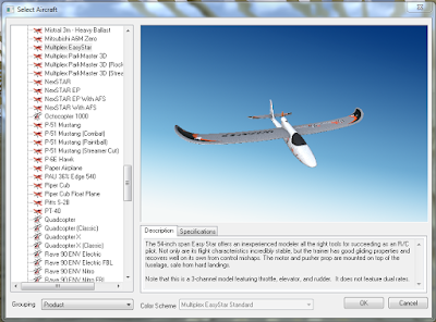
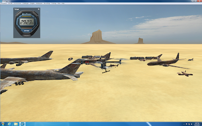
RealFlight is a UAS flight simulation software. Part of the field exercise included completing a flight simulation with a fixed wing system and rotary wing system for 30 minutes each. During the fixed wing flight simulation, I flew a NextSTAR, Multiplex EasyStar, and Predator drone (Figure 4). The simulations taught me that most fixed wing UAS’s are more touchy and faster than rotary wing UAS’s. All of the fixed wing UAS’s I flew were relatively easy to get the hang of. The only system that was cumbersome was the Predator drone, which took a long time to make turns. I learned the rotary wing systems were a lot less touchy than fixed wing systems, but they were a lot slower. Rotary wing systems I flew include a Hexacopter780, QuadcopterX, and X8 Quadcopter (Figure 5). The simulation taught me that rotary wing systems are better for surveying smaller portions of land for high quality imagery, while fixed wing systems are suited for surveying larger portions of land for decent quality imagery.

Figure 4: The Multiplex EasyStar was one of the fixed wing systems I flew in the simulation.

Figure 5: The X8 Quadcopter was a rotary wing UAS I flew in the simulation.

Mission Planner Software:

Mission Planner is a software used to devise automated missions for UAS’s. Although we did not conduct automated flights, we experimented with the software to see how different camera sensors and altitudes affected each mission. We used the practice track field on the upper campus of UW-Eau Claire as our area of interest. As altitude increased in the mission planner, the number of flight lines decreased, which decreased flight time and the amount of pictures taken (Figures 6 and 7). Another factor that decreased the number of flight lines was increasing the flight line angle. Sensor type did not seem to affect the number of flight lines very much. Altitude and flight angle are critical factors to creating successful missions with your available technology. Most UAS’s have maximum flight times of 1-1.5 hours, which means missions must be planned accordingly in advance. Although most of the planned missions for the track field were under five minutes, flight time is still important. For example, flight time is very important when planning missions that involve surveying large amounts of land. Overall, the Mission Planner software is a useful tool for creating successful UAS missions.

Figure 6: The Mission Planner is set at an altitue of 25m with a 0° flight line angle.

Figure 7: The altitude was increaded to 55m, which decreased the number of fligh lines and mission time.

Pix4Dmapper

The Pix4Dmapper software was used to process the imagery collected with the Phantom in the field with Dr. Hupy. Processing created an orthomosaic image and a digital surface model (DSM), which were both brought into ArcMap 10.3.1 to create maps of the surveyed area. The orthomosaic image demonstrates the high quality data the Phantom is capable of capturing (Figure 8), while the hillshade shows how the Phantom can be used to collect elevation information of surveyed surfaces (Figure 9).  Metadata for the orthomosaic image can be seen in Figure 10.

Figure 8: The orthomosaic image collected, generated in Pix4D using data collected by the Phantom, shows a surface feature created by students on the bank of the Chippewa River.

Figure 9: The hillshade of the river bank shows elevation data. 

Figure 10: Metadata for the orthomosaic image created using a Phantom UAS, Pix4D, and ArcMap 10.3.1.


Discussion:

In the field exercise, a client theoretically contacted me to ask how UAS could be used to find where crops were unhealthy on an 8,000 acre pinapple plantaion. Additionally, the client wanted to use UAS to determine when would be the best time to harvest.

Based on the client's needs, I would recomend using a fixed wing UAS with a high quality camera and near-infraraed sensor. Although 8,000 acres could not be economically surveyed by one UAS in a week, multiple fields could be surveyed once a week with a fixed wing UAS. PrecisionHawk's Lancaster is one fixed wing UAS the client could use (Figure 11). The Lancaster has a maximum flight time of 1 hour, and costs roughly $25,000 (DRONELIFE.com, 2014). Other UAS options can be found at http://dronelife.com/2014/10/01/best-agricultural-drones-available-today/. Pictures collected from a high quality camera, like a Gimble, could be used to monitor conditions of the crops, like canopy coverage, moisture, and bug problems. A near-infrared sensor could be used to collect near-infrared imagery, which would show cloporphyll levels in the pineapple trees. Chrolophyll levels are a direct indication of plant health, and can show where crops are stressed (Tenkabaail P.S. and Lyon J.G., 2011). Such information could then be applied to adjust agricultural practices.


Figure 11: PrecisionHawk's Lancaster Hawkeye Mark III is well suited for agricultural monitoring: http://dronelife.com/cms/product/Lancaster-Hawkeye-Mark-III


Another recommended option would be to use LANDSAT 8 satelittle imagery to collect near-infrared imagery for all 8,000 acres. The imagery could be collected every 16 days, or just about every two weeks (United States Geological Survey, 2015). During a regular week, a fixed wing UAS could be used to collect imagery from specific fields, and every two weeks LANDSAT 8 data could be used to monitor the health of the entire plantation. LANDSAT 8 data can be downloaded for free using the information at the following link: http://glovis.usgs.gov/QuickStart.shtml.

To determine the best time to harvest on the pineapple plantation, the Gimble camera and near-infrared sensor could be used to collect weekly data. LANDSAT 8 data collected biweekly would also prove useful. This concludes the client evaluation report.

Conclusion:

Overall, the field exercise helped me learn about the different types of unmanned aerial systems that exist today and their potential applications. I gained hands on experience flying a rotary wing UAS, planning UAS automated flight missions, practicing UAS flying with flight simulation software, and processing imagery collected by a UAS. Unmanned aerial systems have many potential applications, and knowledge of UAS’s will prove to be useful in my future career.

Works Cited:

DRONELIFE.com. (2014). "Lancaster Hawkeye Mark III". Retrieved from: http://dronelife.com/cms/product/Lancaster-Hawkeye-Mark-III

Tenkabaail P.S. and Lyon J.G. (2011). "Hyperspectral Remote Sensing of Vegetation". Retrieved from: https://books.google.com/books?id=B0LNBQAAQBAJ&pg=PA4&lpg=PA4&dq=measuring+chlorophyll+levels+in+plants+in+agriculture&source=bl&ots=93tmw9XO5E&sig=3Y09s51mwiJhebSAY6IIOl2wNrg&hl=en&sa=X&ved=0CEoQ6AEwB2oVChMIlcb79866yAIVBM-ACh2LrQXc#v=onepage&q=measuring%20chlorophyll%20levels%20in%20plants%20in%20agriculture&f=false

United States Geological Survey. (2015). "LANDSAT 8". Retrieved from: http://landsat.usgs.gov/landsat8.php