In this field exercise, we input the coordinate and elevation data we collected in Field Activity 1 into ArcMap 10.3.1 to create 2D models of our terrain survey. The models were then brought into ArcScene 10.3.1 to visualize the models in 3D. Different interpolation methods were used in creating the models so that the best model could be made. After evaluating the model for innacuracies, our team went back out into the field to resurvey areas of the terrain survey that were not captured as accurtely as they should have been. The field exercise improved our geospatial, critical thinking, and field work skills.
Methods:
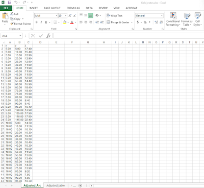
The first objective was to create a 2D model of our terrain survey. We had collected the elevation data in an Excel spreadsheet, but we had to rearrange the data so that it would be compatible in ArcMap 10.3.1. Figure 1 shows that we placed the x, y, and z data in separate columns that would be compatible with ArcMap. It is worth mentioning that the numbers were formated in number formating so that they would be compatible. After the table had been properly formatted. it was imported into a geodatabase and turned into a feature class in ArcMap (Figure 2).
 |
| Figure 1: The excel table was adjusted from its original format so that it could work with ArcMap 10.3.1. |
 |
| Figure 2: The x,y Excel data has been created into a feature class so that it can be manipulated in ArcMap, |
Now that the Excel data had been turned into a feature class, different interpolation methods could be used to create 2D models of the terrain survey. Interpolation predicts the values of cells in a raster based off a limited number of data points. It can predict unknown values for any geographic point data, including elevation (ESRI, n.d.). Interpolation was used to create 2D and 3D models in ArcMap 10.3.1 and ArcScene 10.3.1, respectively. The interpolation methods used for this field activity included:
- IDW
- Natural Neighbors
- Kriging
- Spline
- TIN
All of these interpolations were available to use in ArcToolbox under the Spatial Analyst Tools (Interpolation extension).
Once the interpolations were created, they were brought into ArcScene 10.3.1 to visualize the 3D models. The 3D models were then evaluated for inaccuracies by comparing each model to the picture of the terrain survey. Multiple inaccuracies were found, mostly in areas that had modest changes in elevation. The different interpolation models were also compared to each other to see which method represented the terrain surface most accurately.
After studying the models, our group realized the models were orientated differently than the original terrain surface. Looking at Figure 16, located in the Discussion section of this blog post, one can see the model appears as if it were flipped 180° outward to the back of the screen compared to the original terrain survey. We believe the model was orientated this way because the point of origin was located in the upper left corner of the wood box we surveyed in. Furthermore, we believe ArcMap put the point of origin at the bottom left of the screen, just like a typical graph. This created a model with a different orientation than the original terrain surface. Since we could not fix this without collecting entirely new data, we moved on with the field activity and analyzed the model from a different orientation than normal.
The interpolation methods used in this exercise will now be discussed:
IDW (Inverse Distance Weighted):
The inverse distance weighted interpolation estimates values of raster cells by averaging values of sample data points neighboring the cell to be created. Data points closer to the cell being created have a stronger influence, or weight, on the averaging process of the cell being created (ESRI, n.d.). The 2D IDW model in Figure 3 and the 3D model in Figure 4 demonstrate the inverse distance weighted method creates a relatively accurate, but bumpy model.
The inverse distance weighted interpolation estimates values of raster cells by averaging values of sample data points neighboring the cell to be created. Data points closer to the cell being created have a stronger influence, or weight, on the averaging process of the cell being created (ESRI, n.d.). The 2D IDW model in Figure 3 and the 3D model in Figure 4 demonstrate the inverse distance weighted method creates a relatively accurate, but bumpy model.
 |
| Figure 3: The IDW interpolation method in 2D does an average job at representing the terrain features but has many bumps throughout the image. This was viewed in ArcMap 10.3.1. |
 |
| Figure 4: The IDW model in 3D, as viewed in ArcScene 10.3.1. |
Natural Neighbors:
The natural neighbors interpolation creates new points for a data set by weighting nearby input data and assigning weights based on the proportion of area the points cover (ESRI, n.d.). The weights are used to create an elevation model. The natural neighbors method creates a basic model of the terrain surface that is smoother than the IDW model (Figures 5 and 6).
 |
| Figure 5: The Natural Neighbors interpolation method in 2D also does an average job in representing the terrain features, but is less bumpy than IDW. |
 |
| Figure 6: The Natural Neighbors interpolation in 3D. |
Kriging:
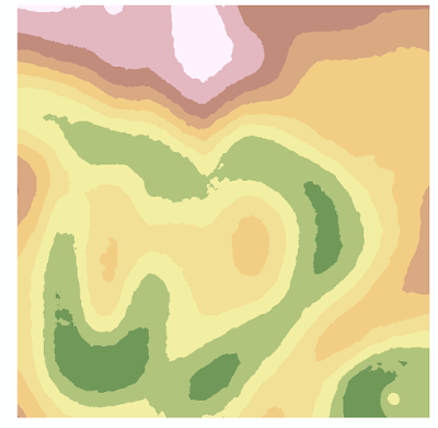
The Kriging interpolation is an advanced geostatistical method that creates an elevation surface from scattered sets of elevation data points. This method uses statistics and mathematical functions to determine spatial patterns in the data set, which are used to predict other values. Kriging is used for spatially correlated data sets and is often used in soil science and geology (ESRI, n.d.). The Kriging models created for our terrain surface (Figures 7 and 8) are very smooth and show the different elevations of the model very well.
 |
| Figure 7: The Kriging interpolation method in 2D smooths the elevation layers more than the IDW or Natural Neighbor methods. This model shows changes in elevation very nicely. |
 |
| Figure 8: The Kriging method in 3D. |
Spline:
The spline interpolation estimates values for a surface using mathematical functions that minimize overall surface curvature. This creates a smooth surface that passes exactly through the input points (ESRI, n.d.). The spline model (Figures 9 and 10) show the least detail of all models, but the surface is very smooth.
 |
| Figure 9: The Spline interpolation method in 2D shows the least detail out of all interpolation methods. |
 |
| Figure 10: The Spline method in 3D. |
TIN (Triangulated Irregular Network)
A TIN (Triangulated Irregular Network) is a vector model based on geographic data that is created by triangulating a set of vertices. The vertices are connected with multiple edges to create a network of triangles. TIN's have been used for many years by the GIS community to represent surface morphology (ESRI, n.d.). Although the TIN models (Figures 11 and 12) show an accurate representation of the terrain survey, they are choppy in appearance which takes away from the model's accuracy.
 |
| Figure 11: The TIN interpolation method in 2D shows an detailed, but choppy representation of the terrain features. |
 |
| Figure 12: The TIN model in 3D. |
After evaluating inaccuracies in our models, our group went back out into the field to resurvey our terrain surface. We first set up the box around the same terrain surface as we had surveyed the prior week. Next, we had to reshape our terrain a bit so that it would resemble the past terrain as close as possible. The terrain had been sitting unprotected outside for a week. Winds and rain had damaged the model slightly, but we rebuilt the sand model to the best of our abilities. After rebuilding the model, we used masking tape to create an x and y axis on the wooden box. A meter stick was used to mark off every centimeter on the tape, and every 10 centimeters was labeled. This created our coordinate system that we would base our measurements off of. Using the meter stick, we took elevation data points in areas that had inaccuracies. For example, we resampled the river valley in the model by taking four to five samples along the bank every twelve centimeters or so. We collected x, y, and z values along the way as we worked throughout the areas that needed resampling. Areas that did not have much elevation change or were represented accurately by the original model were not resampled to save time and energy. Field collection conditions for field activity 2 included the following:
The new data points were input into the same Excel table with accuracy to the closest millimeter. Following the resampling of our terrain survey, we came back in and input new data from the Excel spreadsheet into ArcMap. The new data was turned into a new featuere class, as shown by the x,y data plot in Figure 13.
The new data points were input into the same Excel table with accuracy to the closest millimeter. Following the resampling of our terrain survey, we came back in and input new data from the Excel spreadsheet into ArcMap. The new data was turned into a new featuere class, as shown by the x,y data plot in Figure 13.
 |
| Figure 13: The new x,y data shows the original and resampled survey points. |
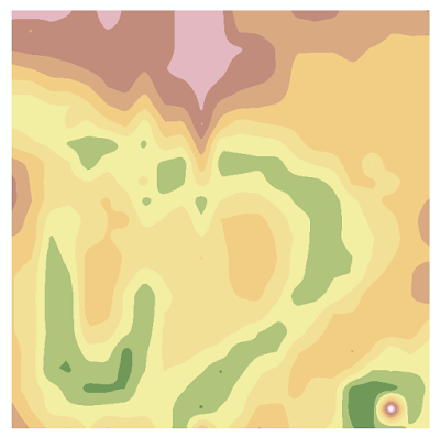
With the data ready to go, a final model of the terrain survey was created in ArcMap with the Kriging interpolation method (Figure 14). The model was brought into ArcScene to view it in 3D, as shown in Figure 15. This concluded the two-week field activity of creating a digital elevation surface of our terrain survey.
 |
| Figure 14: The Kriging interpolation in 2D with the new x,y data shows the best representation of the terrain features. |
 |
| Figure 15: The Kriging method with new x.y data in 3D. |
The spline interpolation model was the least accurate out of all the created models for representing the terrain survey. It showed the least detail in changes in elevation, as seen in the river valley in Figure 9. This is because spline interpolation uses mathematical functions that minimize overall surface curvature of the model, which results in a smoothed surface.
Next, the IDW interpolation model was the fourth best model for the terrain survey. It gave an average representation of the terrain, but it was missing a lot of detail, as seen by the compressed river valley in Figure 3. Figure 4 also demonstrates the IDW model gives a very bumpy appearance to the model, which is not aesthetically pleasing nor accurate of the real world conditions. The bumpy appearance was created because the IDW interpolation uses the weights of nearby data points to create new cells in a raster image. The bumps are seen about every 5cm, which was the spacing of our model at which we collected data points in field exercise 1.
The thrid best model was the Natural Neighbors interpolation model. It was very similar to the IDW model because it did not show that much detail in areas of the model with significant changes in elevation, such as the river (Figures 5 and 6). This similarity exists between the models because the natural neighbors model creates new points for a data set by weighting nearby input data and assigning weights based on the proportion of the area the points cover (ESRI, n.d.). It should be noted the natural neighbors model was less bumpy than the IDW model.
Furthermore, the second best model was the TIN model. The model (Figure 12) shows slightly more detail in changes in elevation than the other models. A disadvatage of this model is that the choppy appearnce of the model is not an accurate representation of the real world surface,
The model that best represents the terrain survey is the Kriging interpolation model. The model shows changes in elevation in the most detail and has a smooth apperance just like the actual terrain model (Figure 7). This level of accuracy was achieved by this model because the Kriging interpolation method uses statistics and mathematical functions to determine spatial patterns in the data set, which are then used to predict other values (ESRI, n.d.).
It was very benefical to resurvey the model because it added a lot of detail in areas of the model that experienced significant elevation changes. The Kriging model in Figure 14 shows many uses of color bands to represent the many changes in elevation in the model. For example, the river runs across almost the entire model and can be seen in green. This detail was missing from the previous models because the first models did not have as many data points from areas that had signicant elevation changes. The river valley, oxbow lake, and depression (bottom right corner) are all fully represented in the Kriging model. The accuracy of the final model can be seen when you compare the model side by side with a picture of the actual terrain survey, as seen in Figure 16.
 |
| Figure 16: A comparison between the Kriging 3D model (new data) and a picture of the terrain survey demonstrates the Kriging model is the most accurate model. |
Conclusion:
Analyzing the differnt interpolation models demostrates the most accurate model for the terrain survey was the Kriging interpolation model. This is because the Kriging interpolation method uses statistics and mathematical functions to determine spatial patterns in the data set, which are then used to predict other values (ESRI, n.d.). The accuracy of this model was increased when our group resurveyed the terrain and collected additional data points in areas that had substantial changes in elevation.
If our group did this activity again, it would be beneficial to make our point of origin at the bottom left of the survey box. I believe this would result in a correctly orientated model in ArcMap and ArcScene. Addtionally, if we had the chance to redo this field exericise, it would be useful to use a laser distance finder. This device sends out a laser and records the time it takes for the laser to return to the finder. The time of laser travel is used to determine the distance the measured object is away from the finder. We were not able to use this device because this exercise encouraged us to learn how to sample a terrain surface with simple technology like meter sticks and string. Additionally, I do not believe our Geography department had six laser distance finders for all six groups to use.
Overall, this field activity and the previous activity greatly helped improve my critical thinking and geospatial skills. Our group had to use the knowledge and resources available to us to create an accurate digital elevation surface of a terrain survey.
Work Cited:
ESRI, "Comparing Interpolation Methods." n.d. Digital file, ArcGIS 10.3.1 Help.

please share the Excel spreadsheet file wiht charts and data?
ReplyDeletethank you.