Monday, September 28, 2015

Field Exercise 3: Conducting a Distance Azimuth Survey

Introduction:

In this lab, we conducted a distance azimuth survey of points on the UW-Eau Claire campus mall. This method of sampling uses distances and azimuths to determine the locations of objects relative to a control point(s). We used a laser distance finder to collect the data, which is a simple piece of equipment that can work in many conditions. The collected data was then used to create a map of the features on the UW-Eau Claire campus mall.

Geographic Setting

Before starting the exercise, our professor took us behind Phillips Hall to test the laser finder. This location was chosen because it had many features around (cars, trees, signs), had a recognizable location for a static control point, and was right outside our classroom.

Our group chose to survey the UW-Eau Claire campus mall to the north of the Davies Student Center (Figure 1). We recorded the distance and azimuth of multiple objects existing in the courtyard, including stone sitting blocks, lamp posts, trees, and signs. The area is the old floodplain of the Chippewa River and has only slight elevational changes. We chose this area because it was on-campus, was free from tall or large obstructions that might interfere with our equipment, and it had multiple points that could be used for control points. We also chose the area because it had many objects we could map, which we needed 100.

Figure 1: An aerial image of the area came from the Eau Claire County geospatial dataset. The 3 inch imagery (2709_29NW) came from the city of Eau Claire. 

Methods:

The first step of the survey before going into the field was to establish control points from where we would collect the rest of our data. Since this data was indirect (we were not collecting GPS coordinates for every point), we needed specific points in our survey that would be easy to identify on a basemap, such as Google Earth. We could then use the coordinates of these locations from Google Earth to determine the relative locations of the other data points. Two control points were established (Figure 2).

Figure 2: The green dots at the center and north east portion of the picture show where the control points were established.
After establishing the control points, we went into the field and collected data. The following is important information to the field exercise:

Equipment List:
  • TruPulse 200 laser distance finder 
  • Compass
  • Notebook and pencil

Potential problems that past students experienced and possible solutions: 
  • Objects were too small to be surveyed
    • Survey objects within 100m
  • Data was not stored in the same coordinate system as the map layer
    • Establish appropriate coordinate system for map layer and data right away
  • Control point coordinates were not accurate enough
    • Examine multiple basemaps (Google Earth, ESRI basemaps, aerial imagery) to determine most accurate coordinates
  • Forgot which features were surveyed
    • Determine an efficient surveying method (left to right, near to far)
  • Accidentally aimed at the object behind the targeted feature
    • Take multiple readings of the same location to make sure

We collected both azimuth and distance data with the TruPulse 200, a laser distance finder (Figure 3). The finder calculates distance using the time it takes for the laser emitted by the finder to reflect off an object and return to the device (Laser Technology Inc, 2015a). The finder also calculates azimuth by calculating the arc distance between a fixed point (true north) and the vertical circle passing through the center of an object. The azimuth is measured clockwise from true north to 360°.  (Laser Technology Inc, 2015b). Before collecting data, we compared true north on the TruPulse 200 to north on a regular compass. The true north of the finder and compass relatively matched, which was important to ensuring data integrity.

The laser distance finder was beneficial for our survey because it collected relatively accurate measurements of our objects. We did not need extremely accurate data, so the finder worked well. One weakness of this measurement tool was that it was tiring to collect data for long periods of time with the finder. It was hard to hold up the device and keep squeezing the trigger for 100 data points. Scrolling through the different screens  on the device was also tiring because we had to keep pressing a button over and over. Another weakness of the device was that it was sometimes hard to aim the small cross hair of the finder on an object far away. This could lead to distance measurement errors.


Figure 3: Our group used a TruPulse 200 laser distance finder to collect bearings (azimuth) and distance readings for each feature (http://www.geo-spektr.ru/product_13123.html).

When working with the laser distance finder, we had to be aware that the data could be influenced by magnetic declination.  Magnetic declination is the variation between the horizontal plane between magnetic north (the direction a compass points towards due to the Earth's magnetic field) and true north (north according meridian lines pointing towards the north pole). It varies by geographic location and over time. To find the true bearing of your location you add magnetic bearing to the magnetic declination, as shown by Figure 4 (National Centers for Environmental Information, 2015). Degrees west for magnetic declination are negative and degrees east are positive. Using a magnetic declination field calculator from NOAA (http://www.ngdc.noaa.gov/geomag-web/), the magnetic declination of both control points in our study area was determined to be 1.08°W ± 0.39°, changing by 0.06° W per year. 

Figure 4: This figure, provided by NOAA (http://www.ngdc.noaa.gov/geomag/icons/case1.gif), demonstrates how to find the true bearing of a location.

For each point we collected the point number, distance, azimuth, and feature type while in the field. We chose distance and azimuth because we were required by the exercise and they were necessary to determine the relative locations of objects on the campus mall. We chose to collect feature type because we wanted to inventory the resources on the campus mall. Also, point number was recorded for each object so objects could be distinguished individually in ArcMap 10.3.1. Once we were done collecting in the field, the data was input into an Excel spreadsheet (Figure 5).
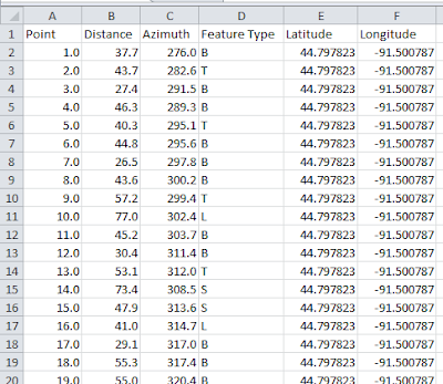

Figure 5: The Excel spreadsheet was used for manipulation in ArcMap 10.3.1.

The coordinates for the two control points were determined by using Google Earth and put into the table. All points collected from one control point were the same latitude and longitude as the control point.

The spreadsheet was then imported into a geodatabase. We later discovered that ArcMap 10.3.1 preferred a text delimited table instead of a xml Excel spreadsheet. Once the spreadsheet was in the geodatabase, the Bearings Distance to Line Tool was used to transform the azimuth and distance readings to line features. This can be seen by the green lines in Figure 6. Next, we used the Feature Vertices to Points Tool to create a point feature class of the data based off the vertices created by the Bearings Distance to Line Tool feature class. This can be seen by the purple points in Figure 6. Both the Bearing Distance to Line Tool and the Feature Vertices to Points Tool are located in the ArcToolbox under Data Management Tools and Features.

To continue, we brought an aerial image of Eau Claire into our map from the EauClaireCity database (image 2709_29NW). We ran into problems again because the data points and bearings did not show up in the map at all. We determined the coordinate system was the problem because we were using the local coordinate system NAD_1983_HARN_WISCRS_EauClaire_County_Feet, which is not very common. The coordinate systems of the data and map were all projected to WGS84, using the Project Tool, located in the ArcToolbox under Data Mangement Tools, then Projections and Transformations. This coordinate system worked, and the reason why it worked was probably because it was a very common coordinate system. 

Finally, we compared the collected bearings and points of the objects to the location of the objects in the Eau Claire imagery to assess the accuracy of the survey. Inaccuracies were found, but it was a decent fit (Figure 6). The data was then used to make a map showing the different objects located on the UW-Eau Claire campus mall (Figure 7). Metadata for the final feature class created using the Feature Vertices to Points Tool can be seen in Figure 8. Collection of data in the field can be seen in Figure 9.


Figure 6: Bearings and points are shown in the image by the green lines and purple dots, respectively. 

Figure 7: Different features can be seen on the landscape in this map

Figure 8: Metadata for the final feature class in the dataset.

Figure 9: Niklas Anderson (partner) uses the TruPulse 200 laser distance finder to survey objects from the second control point near Centennial Hall on the UW-Eau Claire campus mall.

Discussion:

After analyzing the accuracy of the survey with the aerial image, we realized most of the points were mostly off by a small amount. This was most likely due to the fact this was all implicit data; meaning the geographic locations of the objects were all relative to each other. Looking at Figure 6, most of the surveyed points for the objects in the center of the campus mall are very close to their object in the aerial image. There are some points that are very off though. For example, there is one point on top of Schofield Hall, which is the building at the top of the image in Figure 7. Also, there is a point on top of McIntyre Library, which is the building on the left of the image (Figure 7). These errors are most likely due to operator error in measuring distance. When using the laser distance finder, it was sometimes hard to aim the small target in the lens of the finder on an object far away. For the two points that are on top of the rooftops it is likely that we accidentally aimed the laser distance finder at an object behind the intended target, which would result in a distance further away than reality It should also be taken into consideration that it was tiring to hold and press the buttons on the finder for an extended period of time. This could lead to missed points. 

These positional errors do not make the data useless. The purpose of this survey was to determine the relative locations of objects on the UW-Eau Claire campus mall so that the objects could be accurately mapped. This map could then be used by anyone looking to get a better understanding of the objects in the area. People that would find this information useful would include surveyors, landscape designers, and university staff in charge of tracking the resources on campus. Since the survey was relatively accurate, the data still made a good map for inventorying the UW-Eau Claire campus mall. Instances of when extreme accuracy would be needed would be mapping gas wells. The locations of gas wells would be very important to know accurately when drilling in an area with gas wells. 

Overall, the distance azimuth survey is a useful tool for mapping features of a particular area. Example of professionals that would find distance azimuth surveys useful would be foresters inventorying a section of forest or a wildlife biologist mapping the population of a specific species.The latest piece of technology for conducting distance azimuth surveys is a total station, which uses an electromagnetic distance measuring instrument and electronic theodolite (Figure 10) to measure distance and angles (The Constructor, 2015)


Figure 10: A total station in use (http://api.ning.com/files/QHx93MkxAp4Yfb8mAmRNvO-zFW-cayZTnHxd2qBwXBUMMfE3vvVfOx-Y7b5eCDg6VwlU6iCuglSKJ6I*HfZ5JeMZaHS*2ZS3/TrimbleTotalStation.JPG)

Conclusion:

The exercise provided a great experience working with technology that is used by many professionals to survey the land. We also gained experience trouble shooting issues that arose when working with our collected data. For example, we had reproject our data from the local coordinate system to WGS84 for the aerial image of the study area and our data to project together. Our work produce a useful map of the UW-Eau Claire campus mall that can be used to inventory the campus mall's resources. Overall, the field exercise developed useful skills that will help better prepare us for the geospatial workforce.

Works Cited:

Laser Technology Inc. (2015a). "How Lasers Work". Retrieved from: http://www.lasertech.com/How-Lasers-Work.aspx?s=1

Laser Technology Inc. (2015b). "Measuring Azimuth". Retrieved from: http://www.lasertech.com/Laser-Measure-Azimuth.aspx .

National Centers for Environmental Information. (2015). "Magnetic Declination". Retrieved from:http://www.ngdc.noaa.gov/geomag/declination.shtml

The Constructor. (2015). "Total Station-Operation, Uses & Advantages". Retrieved from: http://theconstructor.org/surveying/total-station-operation-uses-advantage/6605/

Friday, September 25, 2015

Field Exercise 2: Visualizing and Refining your Terrain Survey

Introduction:

In this field exercise, we input the coordinate and elevation data we collected in Field Activity 1 into ArcMap 10.3.1 to create 2D models of our terrain survey. The models were then brought into ArcScene 10.3.1 to visualize the models in 3D. Different interpolation methods were used in creating the models so that the best model could be made. After evaluating the model for innacuracies, our team went back out into the field to resurvey areas of the terrain survey that were not captured as accurtely as they should have been. The field exercise improved our geospatial, critical thinking, and field work skills.

Methods:

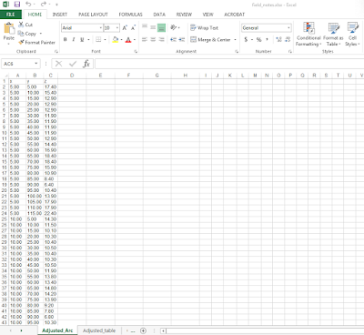
The first objective was to create a 2D model of our terrain survey. We had collected the elevation data in an Excel spreadsheet, but we had to rearrange the data so that it would be compatible in ArcMap 10.3.1. Figure 1 shows that we placed the x, y, and z data in separate columns that would be compatible with ArcMap. It is worth mentioning that the numbers were formated in number formating so that they would be compatible. After the table had been properly formatted. it was imported into a geodatabase and turned into a feature class in ArcMap (Figure 2).


Figure 1: The excel table was adjusted from its original format so that it could work with ArcMap 10.3.1.

Figure 2: The x,y Excel data has been created into a feature class so that it can be manipulated in ArcMap,

Now that the Excel data had been turned into a feature class, different interpolation methods could be used to create 2D models of the terrain survey. Interpolation predicts the values of cells in a raster based off a limited number of data points. It can predict unknown values for any geographic point data, including elevation (ESRI, n.d.). Interpolation was used to create 2D and 3D models in ArcMap 10.3.1 and ArcScene 10.3.1, respectively. The interpolation methods used for this field activity included:
  • IDW
  • Natural Neighbors
  • Kriging
  • Spline 
  • TIN 
All of these interpolations were available to use in ArcToolbox under the Spatial Analyst Tools (Interpolation extension). 

Once the interpolations were created, they were brought into ArcScene 10.3.1 to visualize the 3D models. The 3D models were then evaluated for inaccuracies by comparing each model to the picture of the terrain survey. Multiple inaccuracies were found, mostly in areas that had modest changes in elevation. The different interpolation models were also compared to each other to see which method represented the terrain surface most accurately.

After studying the models, our group realized the models were orientated differently than the original terrain surface. Looking at Figure 16, located in the Discussion section of this blog post, one can see the model appears as if it were flipped 180° outward to the back of the screen compared to the original terrain survey. We believe the model was orientated this way because the point of origin was located in the upper left corner of the wood box we surveyed in. Furthermore, we believe ArcMap put the point of origin at the bottom left of the screen, just like a typical graph. This created a model with a different orientation than the original terrain surface. Since we could not fix this without collecting entirely new data, we moved on with the field activity and analyzed the model from a different orientation than normal.

The interpolation methods used in this exercise will now be discussed:

IDW (Inverse Distance Weighted):

The inverse distance weighted interpolation estimates values of raster cells by averaging values of sample data points neighboring the cell to be created. Data points closer to the cell being created have a stronger influence, or weight, on the averaging process of the cell being create(ESRI, n.d.). The 2D IDW model in Figure 3 and the 3D model in Figure 4 demonstrate the inverse distance weighted method creates a relatively accurate, but bumpy model.

Figure 3: The IDW interpolation method in 2D does an average job at representing the terrain features but has many bumps throughout the image. This was viewed in ArcMap 10.3.1.

Figure 4: The IDW model in 3D, as viewed in ArcScene 10.3.1.

Natural Neighbors:

The natural neighbors interpolation creates new points for a data set by weighting nearby input data and assigning weights based on the proportion of area the points cover (ESRI, n.d.). The weights are used to create an elevation model. The natural neighbors method creates a basic model of the terrain surface that is smoother than the IDW model (Figures 5 and 6). 

Figure 5: The Natural Neighbors interpolation method in 2D also does an average job in representing the terrain features, but is less bumpy than IDW.

Figure 6: The Natural Neighbors interpolation in 3D.

Kriging:

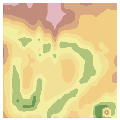
The Kriging interpolation is an advanced geostatistical method that creates an elevation surface from scattered sets of elevation data points. This method uses statistics and mathematical functions to determine spatial patterns in the data set, which are used to predict other values. Kriging is used for spatially correlated data sets and is often used in soil science and geology (ESRI, n.d.). The Kriging models created for our terrain surface (Figures 7 and 8) are very smooth and show the different elevations of the model very well. 


Figure 7: The Kriging interpolation method in 2D smooths the elevation layers more than the IDW or Natural Neighbor methods. This model shows changes in elevation very nicely.

Figure 8: The Kriging method in 3D.

Spline:

The spline interpolation estimates values for a surface using mathematical functions that minimize overall surface curvature. This creates a smooth surface that passes exactly through the input points (ESRI, n.d.). The spline model (Figures 9 and 10) show the least detail of all models, but the surface is very smooth.

Figure 9: The Spline interpolation method in 2D shows the least detail out of all interpolation methods.

Figure 10: The Spline method in 3D.

TIN (Triangulated Irregular Network)

A TIN (Triangulated Irregular Network) is a vector model based on geographic data that is created by triangulating a set of vertices. The vertices are connected with multiple edges to create a network of triangles. TIN's have been used for many years by the GIS community to represent surface morphology (ESRI, n.d.). Although the TIN models (Figures 11 and 12) show an accurate representation of the terrain survey, they are choppy in appearance which takes away from the model's accuracy.

Figure 11: The TIN interpolation method in 2D shows an detailed, but choppy representation of the terrain features.

Figure 12: The TIN model in 3D.

After evaluating inaccuracies in our models, our group went back out into the field to resurvey our terrain surface. We first set up the box around the same terrain surface as we had surveyed the prior week. Next, we had to reshape our terrain a bit so that it would resemble the past terrain as close as possible. The terrain had been sitting unprotected outside for a week. Winds and rain had damaged the model slightly, but we rebuilt the sand model to the best of our abilities. After rebuilding the model, we used masking tape to create an x and y axis on the wooden box. A meter stick was used to mark off every centimeter on the tape, and every 10 centimeters was labeled. This created our coordinate system that we would base our measurements off of. Using the meter stick, we took elevation data points in areas that had inaccuracies. For example, we resampled the river valley in the model by taking four to five samples along the bank every twelve centimeters or so. We collected x, y, and z values along the way as we worked throughout the areas that needed resampling. Areas that did not have much elevation change or were represented accurately by the original model were not resampled to save time and energy. Field collection conditions for field activity 2 included the following:


The new data points were input into the same Excel table with accuracy to the closest millimeter. Following the resampling of our terrain survey, we came back in and input new data from the Excel spreadsheet into ArcMap. The new data was turned into a new featuere class, as shown by the x,y data plot in Figure 13.

Figure 13: The new x,y data shows the original and resampled survey points.

With the data ready to go, a final model of the terrain survey was created in ArcMap with the Kriging interpolation method (Figure 14). The model was brought into ArcScene to view it in 3D, as shown in Figure 15. This concluded the two-week field activity of creating a digital elevation surface of our terrain survey.


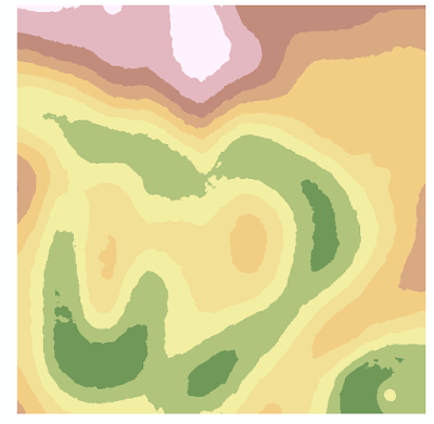
Figure 14: The Kriging interpolation in 2D with the new x,y data shows the best representation of the terrain features.

Figure 15: The Kriging method with new x.y data in 3D.

Discussion:

The spline interpolation model was the least accurate out of all the created models for representing the terrain survey. It showed the least detail in changes in elevation, as seen in the river valley in Figure 9. This is because spline interpolation uses mathematical functions that minimize overall surface curvature of the model, which results in a smoothed surface.

Next, the IDW interpolation model was the fourth best model for the terrain survey. It gave an average representation of the terrain, but it was missing a lot of detail, as seen by the compressed river valley in Figure 3. Figure 4 also demonstrates the IDW model gives a very bumpy appearance to the model, which is not aesthetically pleasing nor accurate of the real world conditions. The bumpy appearance was created because the IDW interpolation uses the weights of nearby data points to create new cells in a raster image. The bumps are seen about every 5cm, which was the spacing of our model at which we collected data points in field exercise 1.

The thrid best model was the Natural Neighbors interpolation model. It was very similar to the IDW model because it did not show that much detail in areas of the model with significant changes in elevation, such as the river (Figures 5 and 6). This similarity exists between the models because the natural neighbors model creates new points for a data set by weighting nearby input data and assigning weights based on the proportion of the area the points cover (ESRI, n.d.). It should be noted the natural neighbors model was less bumpy than the IDW model.


Furthermore, the second best model was the TIN model. The model (Figure 12) shows slightly more detail in changes in elevation than the other models. A disadvatage of this model is that the choppy appearnce of the model is not an accurate representation of the real world surface, 

The model that best represents the terrain survey is the Kriging interpolation model. The model shows changes in elevation in the most detail and has a smooth apperance just like the actual terrain model (Figure 7). This level of accuracy was achieved by this model because the Kriging interpolation method uses statistics and mathematical functions to determine spatial patterns in the data set, which are then used to predict other values (ESRI, n.d.). 

It was very benefical to resurvey the model because it added a lot of detail in areas of the model that experienced significant elevation changes. The Kriging model in Figure 14 shows many uses of color bands to represent the many changes in elevation in the model. For example, the river runs across almost the entire model and can be seen in green. This detail was missing from the previous models because the first models did not have as many data points from areas that had signicant elevation changes. The river valley, oxbow lake, and depression (bottom right corner) are all fully represented in the Kriging model. The accuracy of the final model can be seen when you compare the model side by side with a picture of the actual terrain survey, as seen in Figure 16. 


Figure 16: A comparison between the Kriging 3D model (new data) and a picture of the terrain survey demonstrates the Kriging model is the most accurate model.


Conclusion:

Analyzing the differnt interpolation models demostrates the most accurate model for the terrain survey was the Kriging interpolation model. This is because the Kriging interpolation method uses statistics and mathematical functions to determine spatial patterns in the data set, which are then used to predict other values (ESRI, n.d.). The accuracy of this model was increased when our group resurveyed the terrain and collected additional data points in areas that had substantial changes in elevation. 

If our group did this activity again, it would be beneficial to make our point of origin at the bottom left of the survey box. I believe this would result in a correctly orientated model in ArcMap and ArcScene. Addtionally, if we had the chance to redo this field exericise, it would be useful to use a laser distance finder. This device sends out a laser and records the time it takes for the laser to return to the finder. The time of laser travel is used to determine the distance the measured object is away from the finder. We were not able to use this device because this exercise encouraged us to learn how to sample a terrain surface with simple technology like meter sticks and string. Additionally, I do not believe our Geography department had six laser distance finders for all six groups to use. 

Overall, this field activity and the previous activity greatly helped improve my critical thinking and geospatial skills. Our group had to use the knowledge and resources available to us to create an accurate digital elevation surface of a terrain survey. 

Work Cited:

ESRI, "Comparing Interpolation Methods." n.d. Digital file, ArcGIS 10.3.1 Help.


Friday, September 18, 2015

Field Exercise #1: Creation of a Digital Elevation Surface

Introduction:

The purpose of this lab was to create a digital elevation model (DEM) of a landscape created in a 4'x4' box. The three members of our group created the model using a coordinate system and available supplies.

A digital elevation model is a digital cartographic dataset that has x, y, and z coordinates (Gould, 2012). The x and y coordinates are used for reference on the terrain surface, and the z value is used for elevation of the surface. Elevation values are collected at regular intervals on the surface to create an accurate representation of the surface (Gould, 2012). Coordinate systems can be used to collect data at regular intervals. The USGS provides DEM's for many differernt regions in a database called 3DEP View, which can be accessed at this link: http://viewer.nationalmap.gov/basic/?basemap=b1&category=ned,nedsrc&title=3DEP%20View.

Digital elevation models are very useful because they can be used to understand how changes in the model could affect the environment. These models also provide many different angles of the landscape under investigation. The activity helped develop my critical thinking and geospatial skills by learning how to create a digital elevation surface from a coordinate system model and available materials.

Methods:

Data was taken in the field for this exercise. Field conditions the day the data was taken include:
  • Time: 17:45-19:30
  • Location: UWEC campus, under the walking bridge on the point bar of the Chippewa River 
  • Coordinates: 44.800553 N, -91.500898 W
  • Temperature: 82°F starting and 79°F ending
  • Weather: 10-15 mph winds, partly cloudy
  • Terrain condition: Mosly sand, but some small pebbles
Materials used: 
  • 4'x4' wooden box
  • 1 roll of string
  • 30 pins
  • 1 foldable measuring stick
  • 1 meter stick
  • 1 small bucket
A terrain was created with the following features: a ridge, hill, depression, valley, and plain. A Cartesian coordinate system with resolution of 5cm spacing was set up in the 4'x4' wooden box (Figure 1). The terrain was created by hand by using sand on the point bar and water from the nearby Chippewa River. A small bucket was used to carry water from the Chippewa River to the sand terrain. The water was used to cement the sand in place, which would make taking measurements much easier and preserve the terrain.

We decided to create a terrain all below the top of the box, and deem the top of the box sea level. Measurements were taken from the top of the box to the surface of the terrain. These measurements were subtracted from the height of the box, which would give us the elevation values of the terrain "below sea level".

Pins were inserted into the wood every 5 cm along the x and y axes of the box. String was wooven around the pins to create the x axis, and a foldable meter stick was used as the y axis. Elevation data, recorded as z values, were sampled with a measuring stick to the closest millimeter (Figure 2). Point were collected for each "column", and all coordinate data was collected for a column before moving onto the next column (Figure 3). Based on our resolution, we collected 552 elevation points.  Data was recorded in the field on a Microsoft Excel spreadsheet containing x, y, and z columns (Figure 4). Pictures were taken with a smart phone camera.


Figure 1: Setup of the terrain shows the coordinate system that we used. The terrain includes real-world landscape features including a ride, hill, depression, valley, and plain.  

Figure 2: The picture shows a close-up view of how we sampled elevation data for the terrain.

Figure 3: Team members collect elevation data along the x,y coordinate system. Our team collected 552 elevation points based on our 5cm-spaced coordinate system. 

Figure 4: X, Y, and Z values were input into an Excel spreadsheet, which will later be exported as a shapefile into ArcMap 10.3.1 to create a digital elevation model.

Discussion: 

This exercise was great for developing our critical thinking skills because we had to think about how we would survey the terrain accurately. Team work was very important for finding the answer in an efficient manner. After looking at past student blogs and brainstroming, we concluded that using a coordinate system would be the best way to collect elevation data for the terrain surface. This used spatial thinking to help understand the terrain.

The excerise posed more questions to critically think about. First, should we create a terrain that was all above or below the top of the box? We decided to create a terrain all below the top of the box, and deem the top of the box sea level. Measurements were taken from the top of the box to the surface of the terrain. These measurements were subtracted from the height of the box, which would give us the elevation values of the terrain "below sea level". Another question we considered was where would be the best location to do this exercise? We concluded that the sandy point bar on the Chippewa River under the UWEC footbridge would give us a moldable environment to shape to our liking. To continue, what resolution was appropriate to accurately capture the elevational changes of the terrain? After trying differnt spacings, we concluded that a 5cm resolution would capture most significant elevational changes. Furthermore, this resolution balanced between the time input into collecting data and the quality of the model produced.

There may have been some possible inaccuracies in the data collection method. The main innaccuracy would come from the fact that the sand would shift slightly sometimes when we placed the meter stick on the sand. This was because the sand was dry, and therefore easily moved by an object touching it. Our group did the best we could to take measurements without disturbing the surface.

A challenge our group will face in the future will be resampling our terrain for the next exercise. This is because the dry sand will probably move slightly from being exposed to the elements for a week. If we could do this exercise over,we would use a different material for terrain that would hold better during measurements and for resampling. A more resistant material could be clay.

Conclusion:

In this exercise, we used critical thinking and spatial skills to collect elevation data for a terrain using a coordinate system and available supplies.The elevation data was put into a spreadsheet that will be later converted to a shapefile to use for creating the digital elevation model in ArcGIS 10.3.1.

We learned it is important to be able to think on your feet and use the resources you have available to you. The exercise taught us that sometimes the best way to complete a task is to use old school methods and simple technology. Finally, team work is a great way to accomplish tasks in an efficient and effecive manner.

Works Cited:

Gould, M., "Digital Elevation Model (DEM)." USGS. n.p., 13 December 2012. Web. 20 September 2015. http://tahoe.usgs.gov/DEM.html